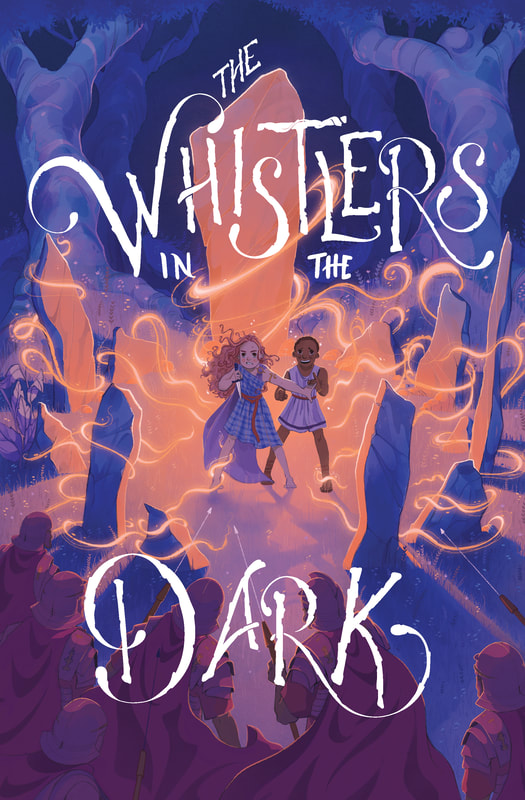
The Whistlers in the Dark
|
|
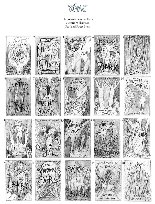
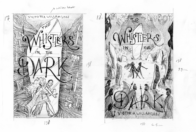
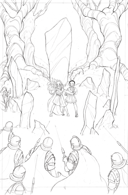
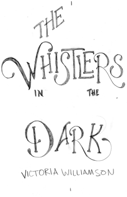
Thumbnails for the cover of The Whistlers in the Dark. I came up with 20 alternative ideas for Scotland Street Press to choose from, playing with various locations, ideas, imagery from the book.
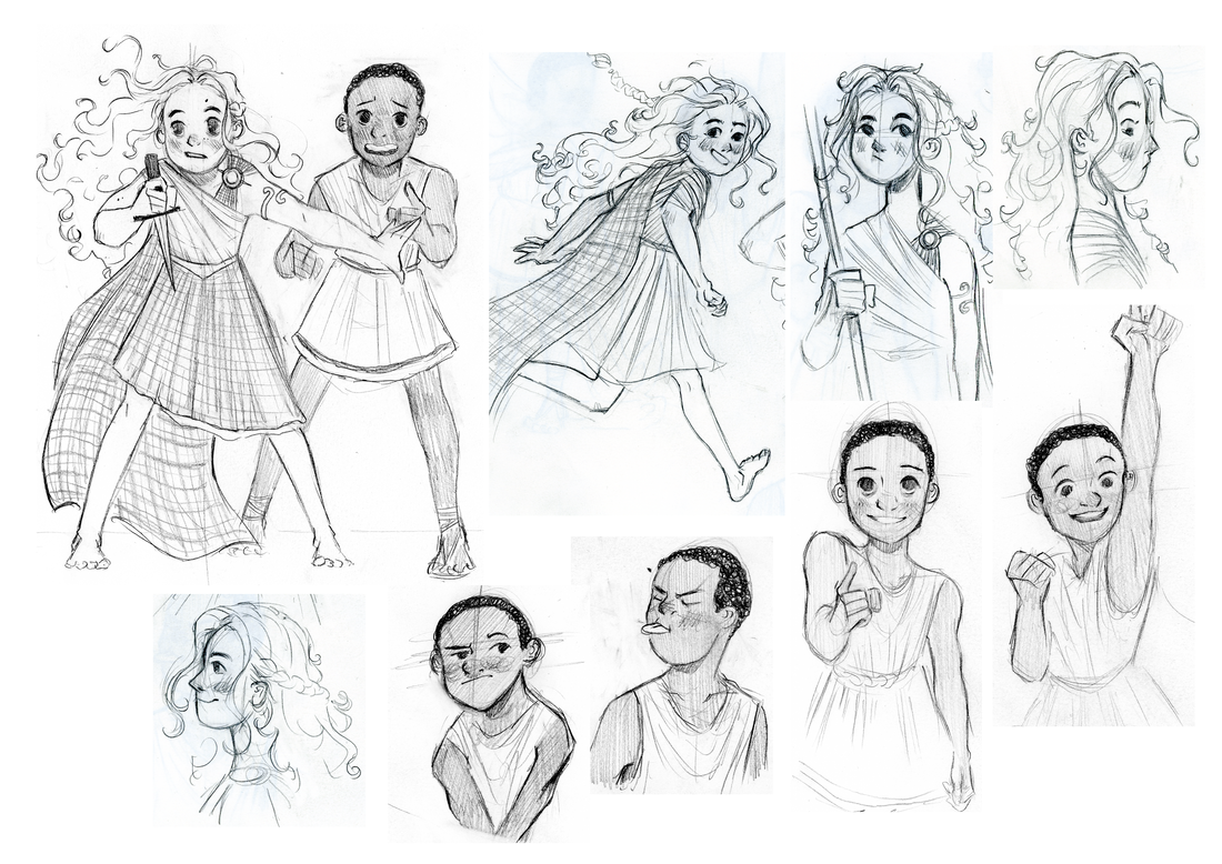
When I get a project like this, I read through the brief and the manuscript and make notes about what might be useful to include on the cover. The Roman spike pits, for one, (although that might be a little dark), but the woods, the stones, the legion's eagle. I try and get rid of the obvious compositions and solutions first when I start thumbnailing and try and come up with creative posing, layers, imagery that allude to the contents of the book and the story the author is trying to tell. Thumbnailing is pretty fun! I actually ended up with more ideas than I included here. |
The Golden Hours - A Literary Salon's Anthology
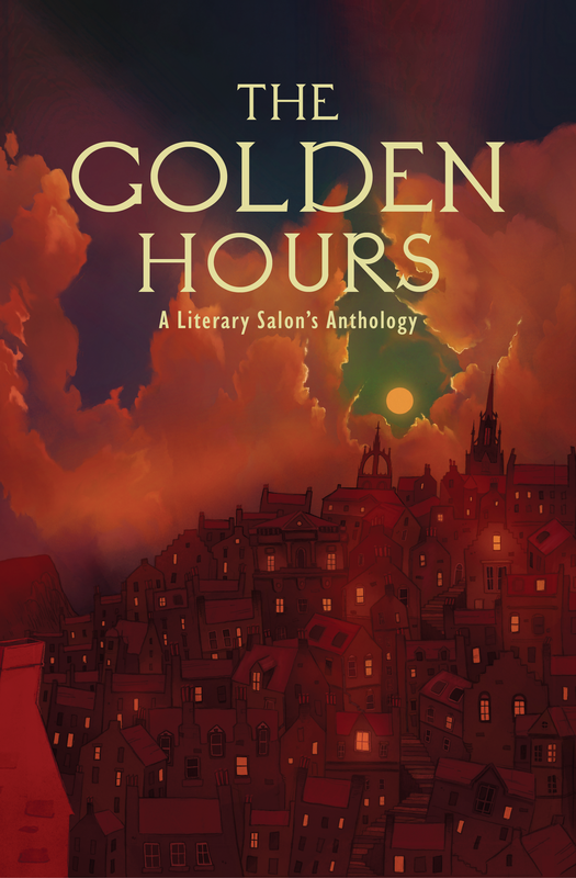
The Golden Hours was the Edinburgh Literary Salon's second anthology project. I worked on the first anthology Lost, Looking, and Found as a master's student (2020-2021), and when they approached me to work on this one I'm glad I said yes.
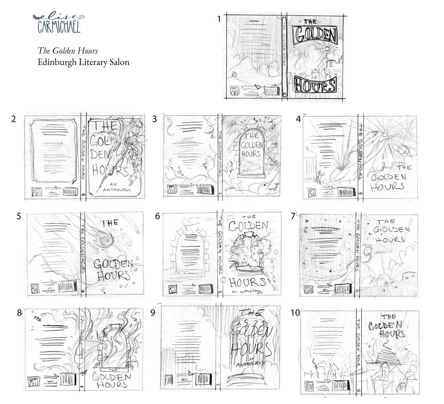
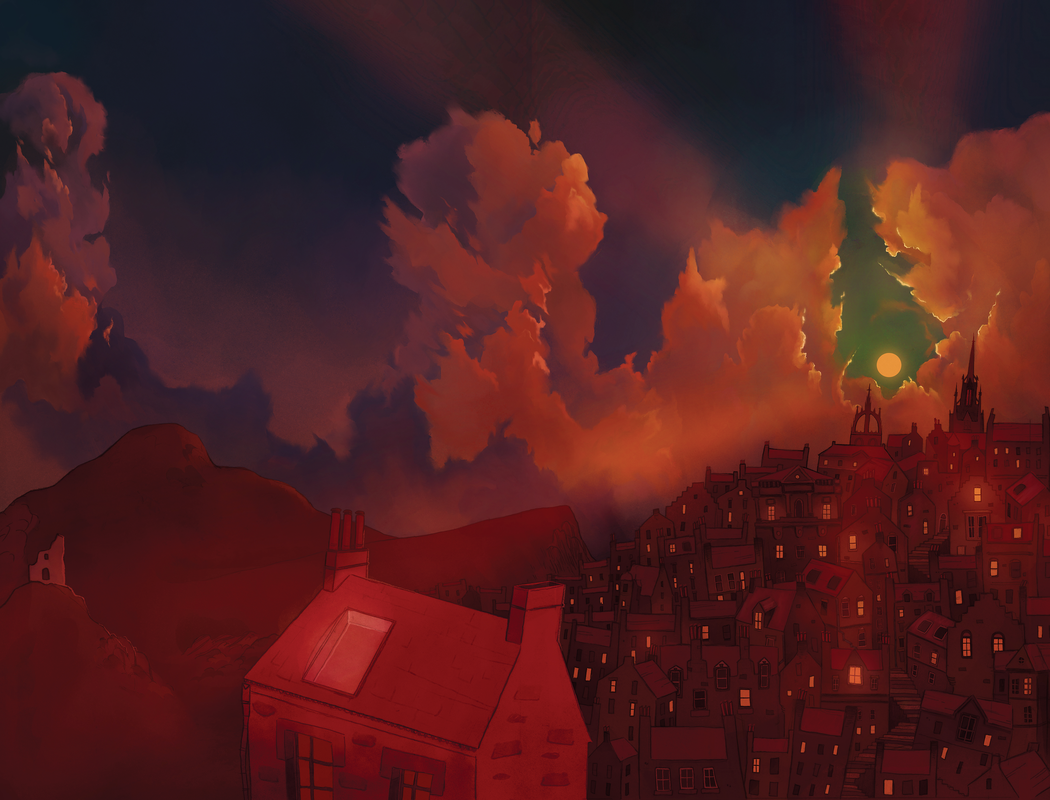
This cover was more painterly than illustrative like the Whistlers. It was a fun experiment and I really enjoyed combining the pencil drawing buildings and the digital sky. When we met to talk about what we wanted for the cover, we talked about recognizable Edinburgh buildings and skylines. The title had already been decided and the Salon knew they wanted that time of day reflected on the cover. I took notes and made some sketches and ended up going with exploring the idea of Edinburgh at sunset. What does it feel like and what might it look like in a memory, as opposed to an exact replica of the city, building for building. I really love how this cover came out and the Salon did as well. |
Cassette Covers
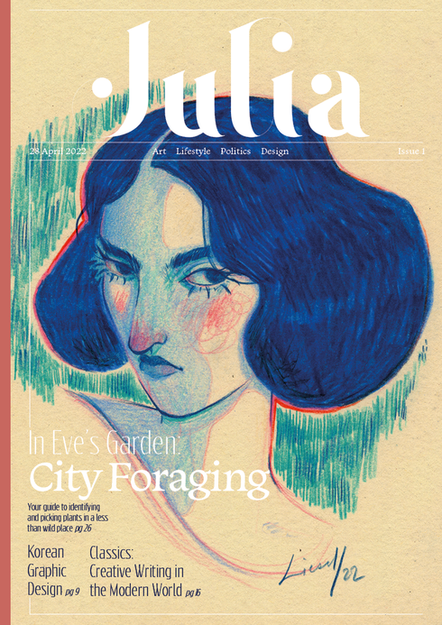
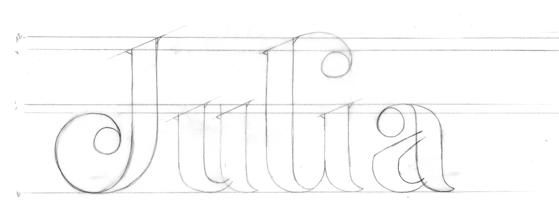
Julia was a personal and still ongoing project for a middle-grade age magazine for young girls. I have vague memories of flipping through my older sister's magazines and being a bit enamoured, and a little confused, about some of the content. It didn't stop me from reading them though!
A bit of a combination of 'Highlights' for older kids, and a bit more creatively aligned in theory, and a little touch of the 'Jugend' magazine covers, 'Julia' would be a magazine for a younger girl entering the world with an international expanse and a bit more of a focus on academics and the world around you. Accepting of essays, prose, and poetry, along with written articles like the examples on the cover to the left, 'Julia' would release quarterly with the seasons. |
|
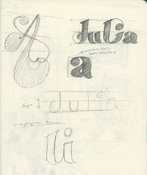
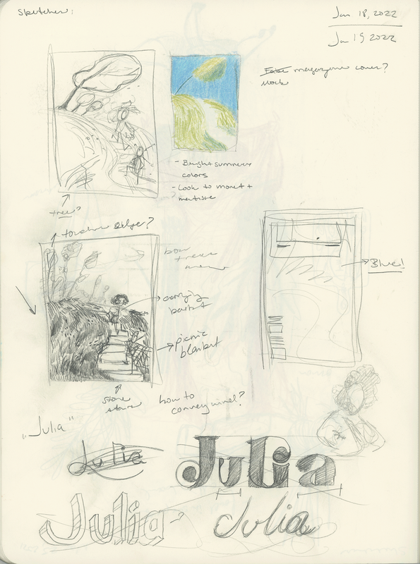
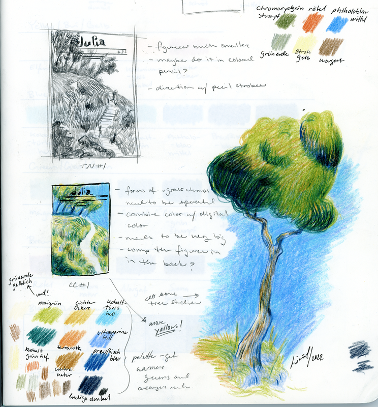
The colors and style of a mock cover for the magazine paired with compositional sketches and the style I want to achieve for a 'summer' edition of 'Julia'.
Writing everything out helps me gather my thoughts around a piece and allows me to ask what I'm trying to achieve with it in terms of emotions, feelings, style, composition, and whether it's going to challenge me artistically. I've been experimenting with colored pencil and digital color and this project has allowed me to think about color in new ways that I had never been able to before. |

